led lighting saBrand Identity Refresh
Visual Language
Tonality & Communication
Livery & Collateral
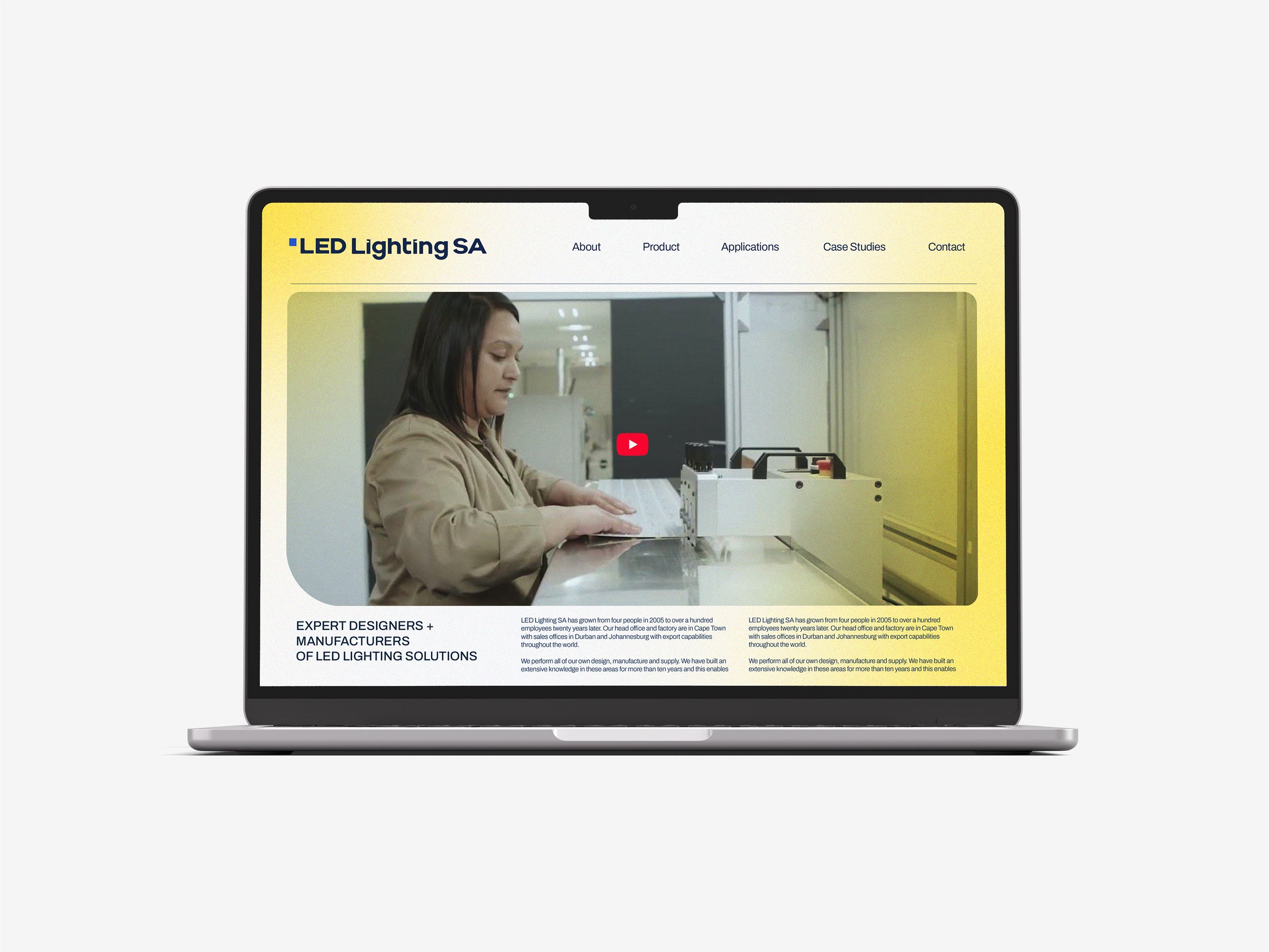
LLSA is a South African B2B LED specialist. For over twenty years they've handled everything in-house. Design, manufacture, and supply, meaning tighter quality control and products built to each client's exact spec, not whatever's available off-the-shelf.
The business was solid, but the brand wasn't keeping up. The refresh needed to reflect the expertise behind it: technically credible, design-led, premium but approachable, and consistent across every touchpoint.
The goal was simple: shift perception from "product supplier" to "end-to-end solutions partner."
Before
After
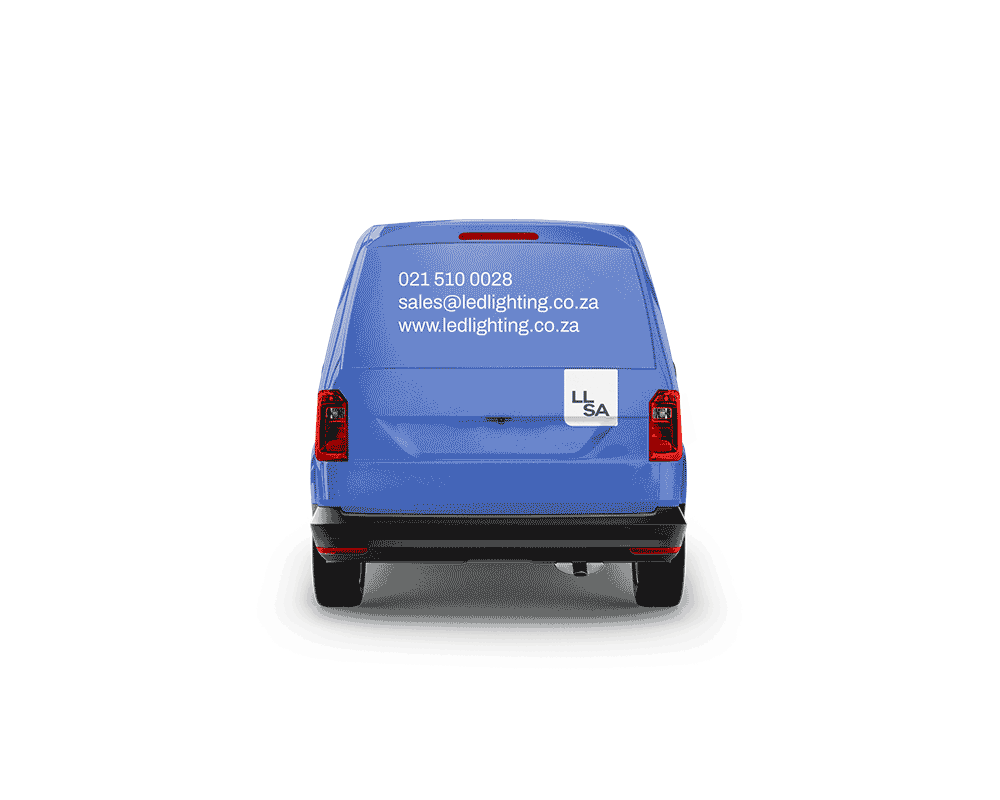
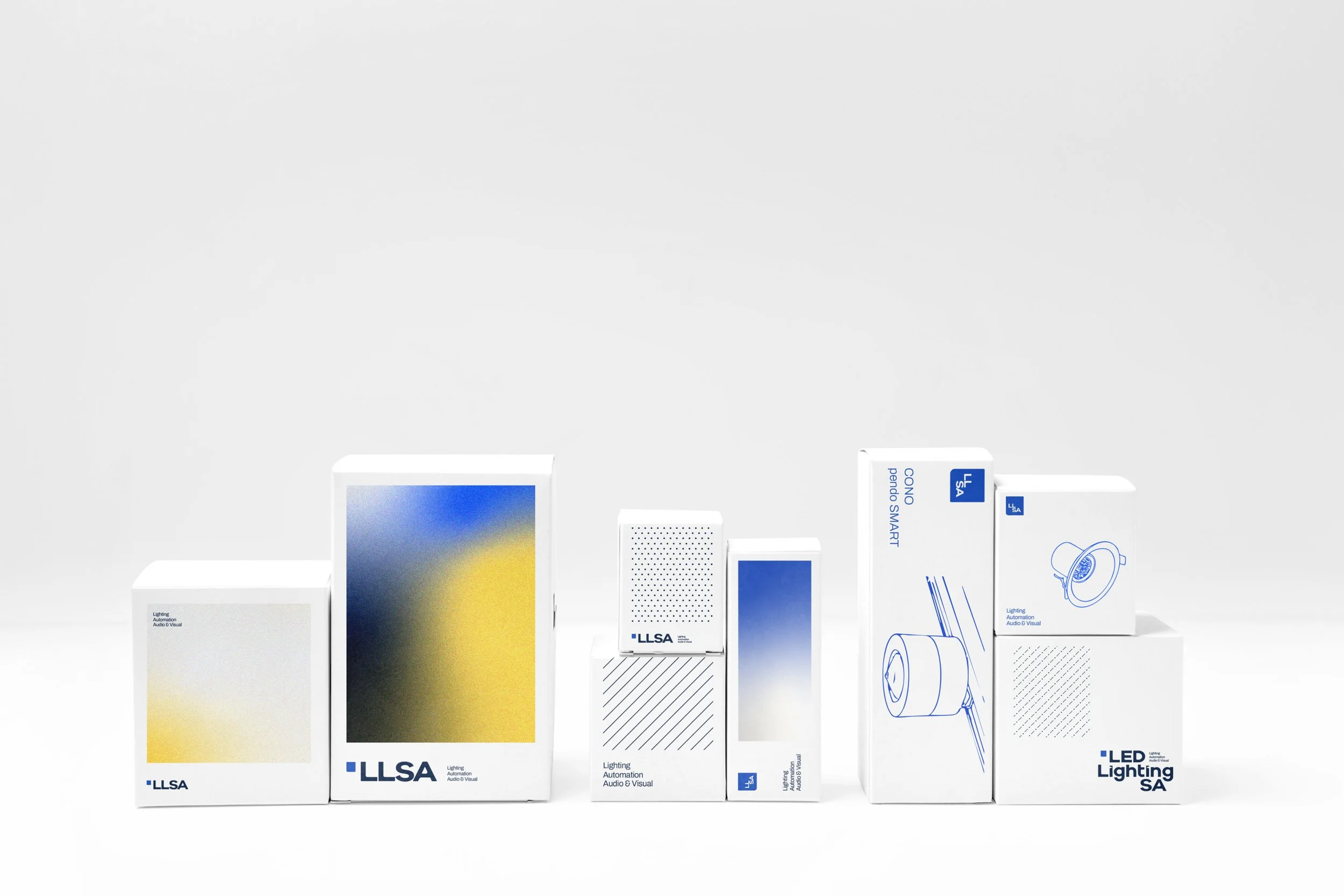
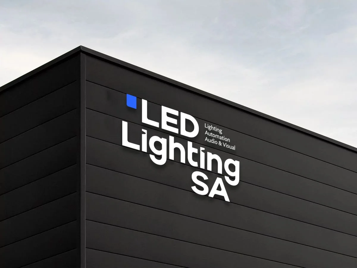
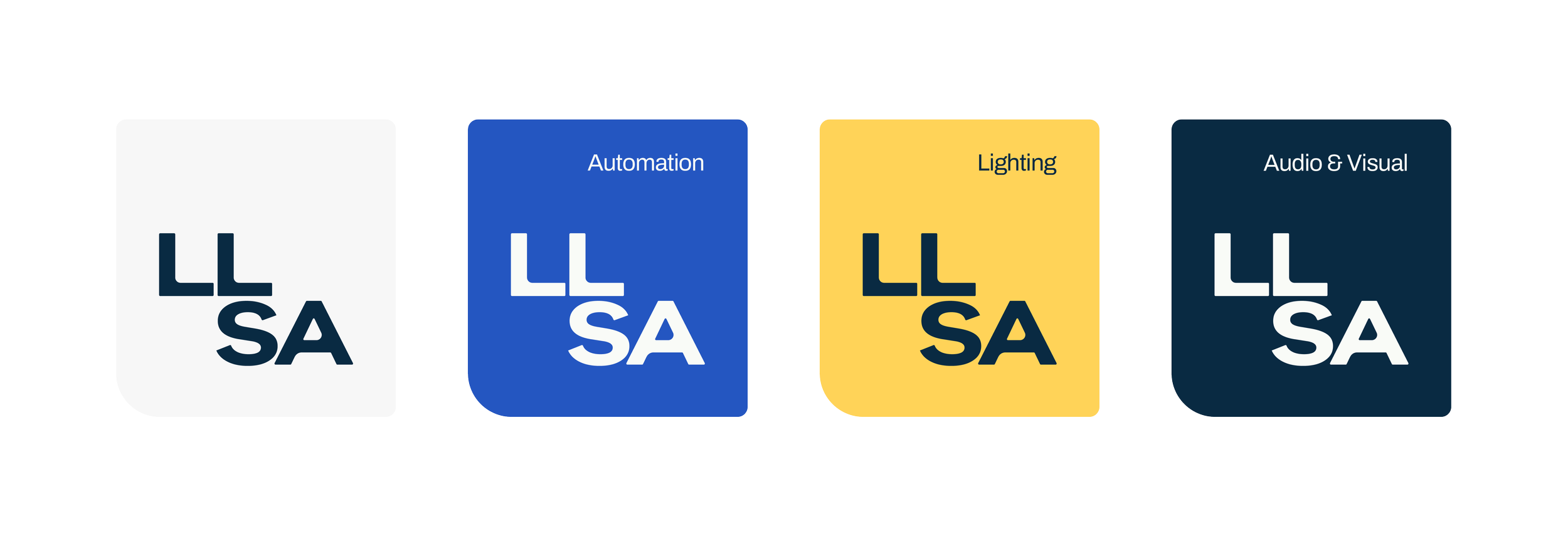
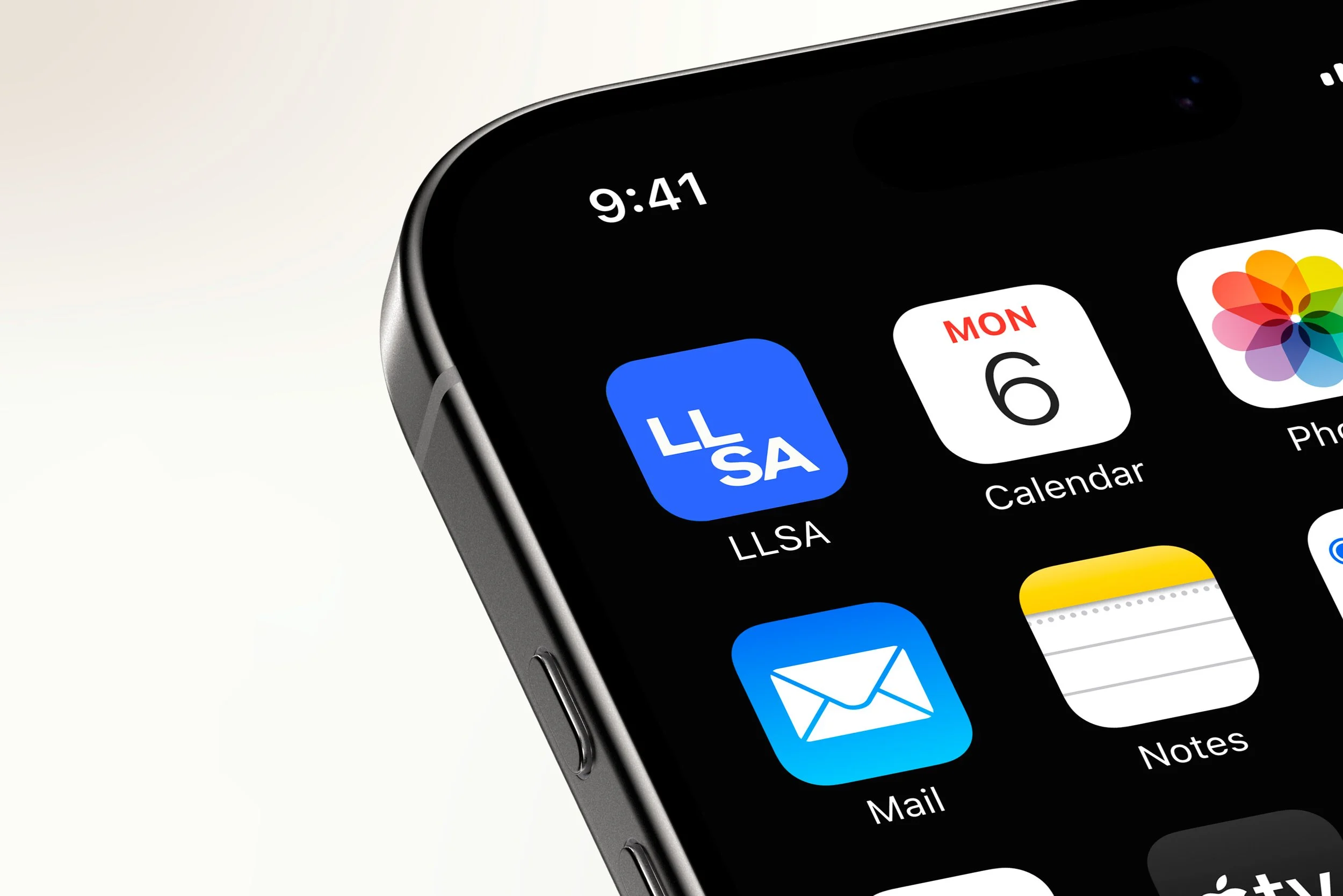
The full name, LED Lighting SA, is used where it counts most — signage, proposals, and formal communications. The "SA" roots it locally while signalling national reach. LLSA is the shorthand: compact, confident, and built for tighter spaces like vehicle livery, packaging, app icons, and labels.
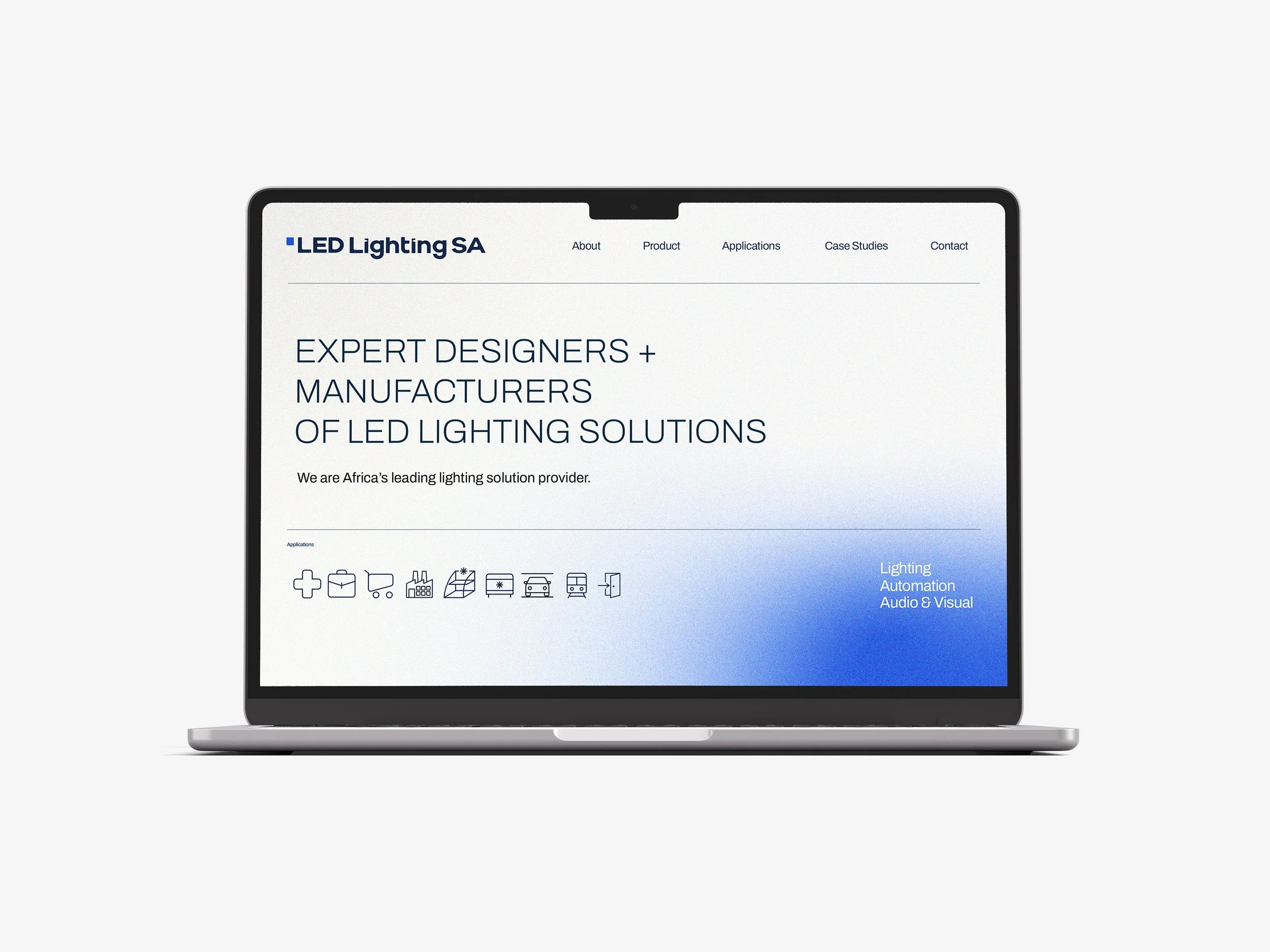
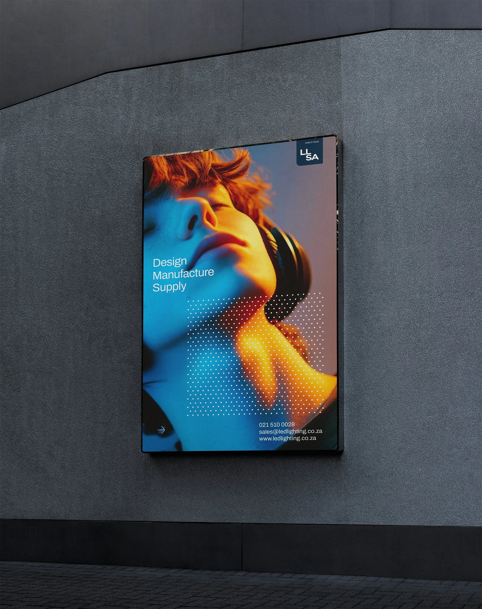
The palette balances precision with energy, much like the product itself. Deep Navy anchors the brand with authority and weight. Electric Blue does the heavy lifting as the dominant colour across communications, UI, and environments. Solar Yellow adds warmth and punch — used as an accent.
Across digital and lifestyle applications, gradient blends (blue-to-navy, blue-to-yellow, soft atmospherics) keep the brand feeling dynamic rather than flat or corporate.
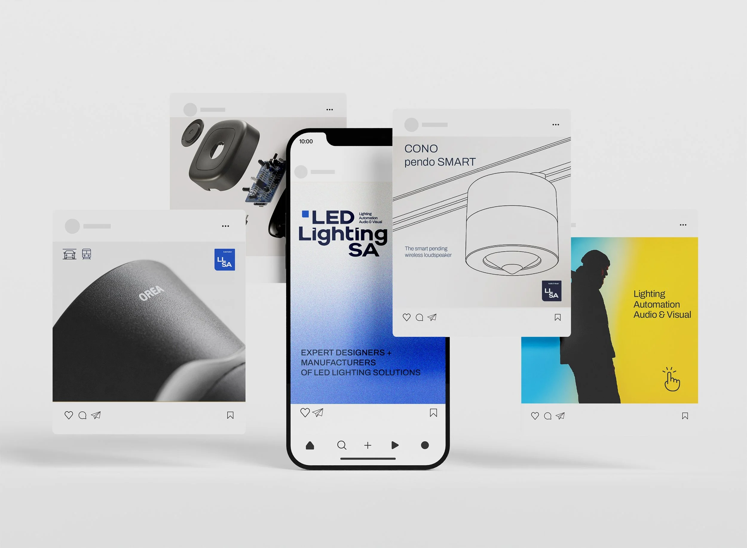
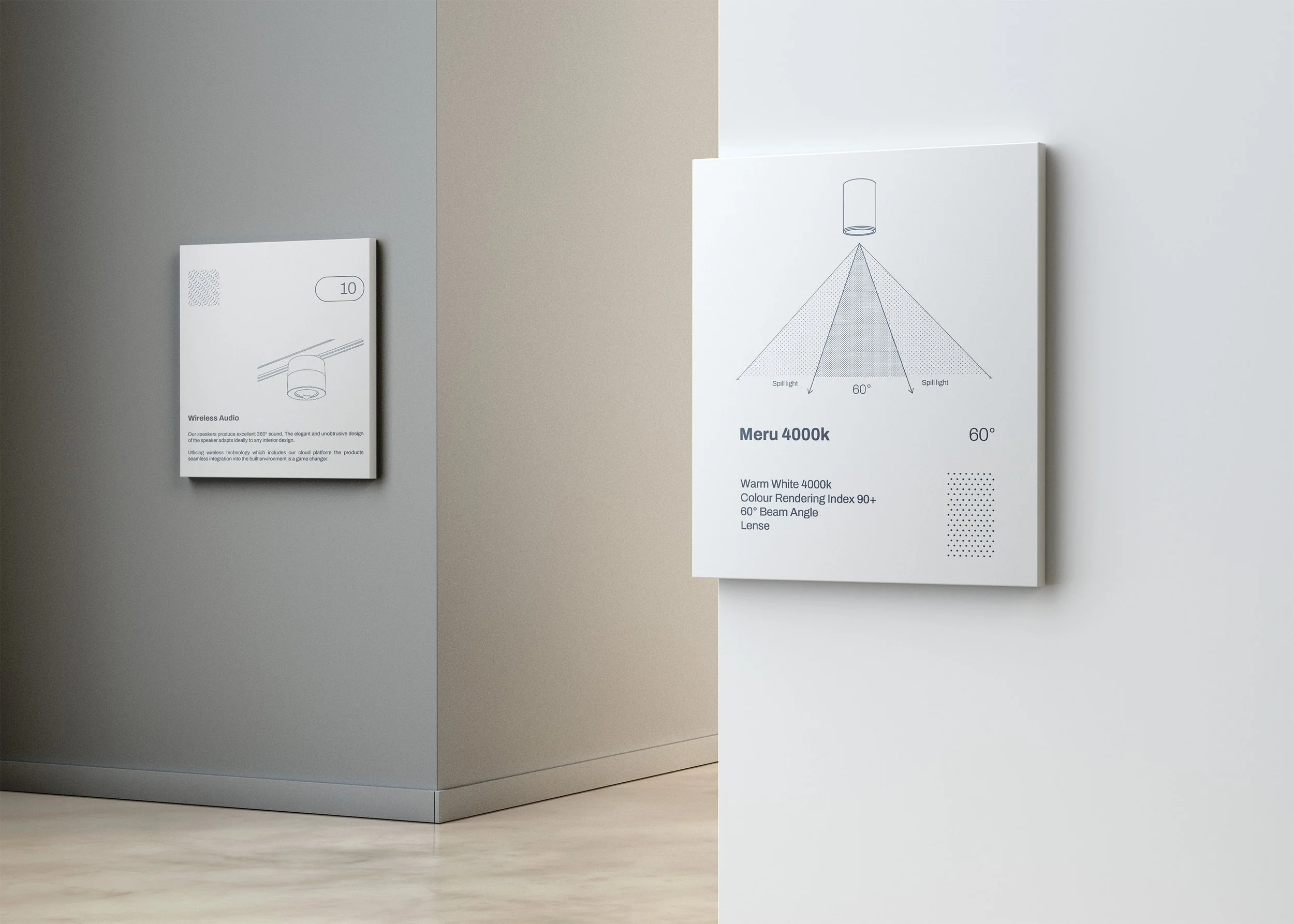
The visual system draws from technical drawing conventions — diagonal lines, dot grids, cross-hatching. These are applied as background textures across packaging, stationery, and environmental graphics. It adds depth without noise.
Layouts use a disciplined grid with type overprinted on photographic and gradient fields, referencing the layered complexity of the systems LLSA builds.
Photography splits into two modes: clinical and precise for product and installation work; dramatic and colour-rich for lifestyle and experiential content. The brand gradient ties both together as a consistent overlay.