medxBrand Identity Refresh
Visual Language
Communication
Livery & Collateral

MedX, a Cape Town-based billing and collections service, decided to flip the script entirely. Instead of playing into the cold, corporate stereotype that dominates the industry, they positioned themselves as the colleague doctors didn't know they needed. The one who handles all the admin nightmares so healthcare professionals can focus on actually healing people.
The brief was clear: look credible and professional while also feeling genuinely human and caring.
Before
After
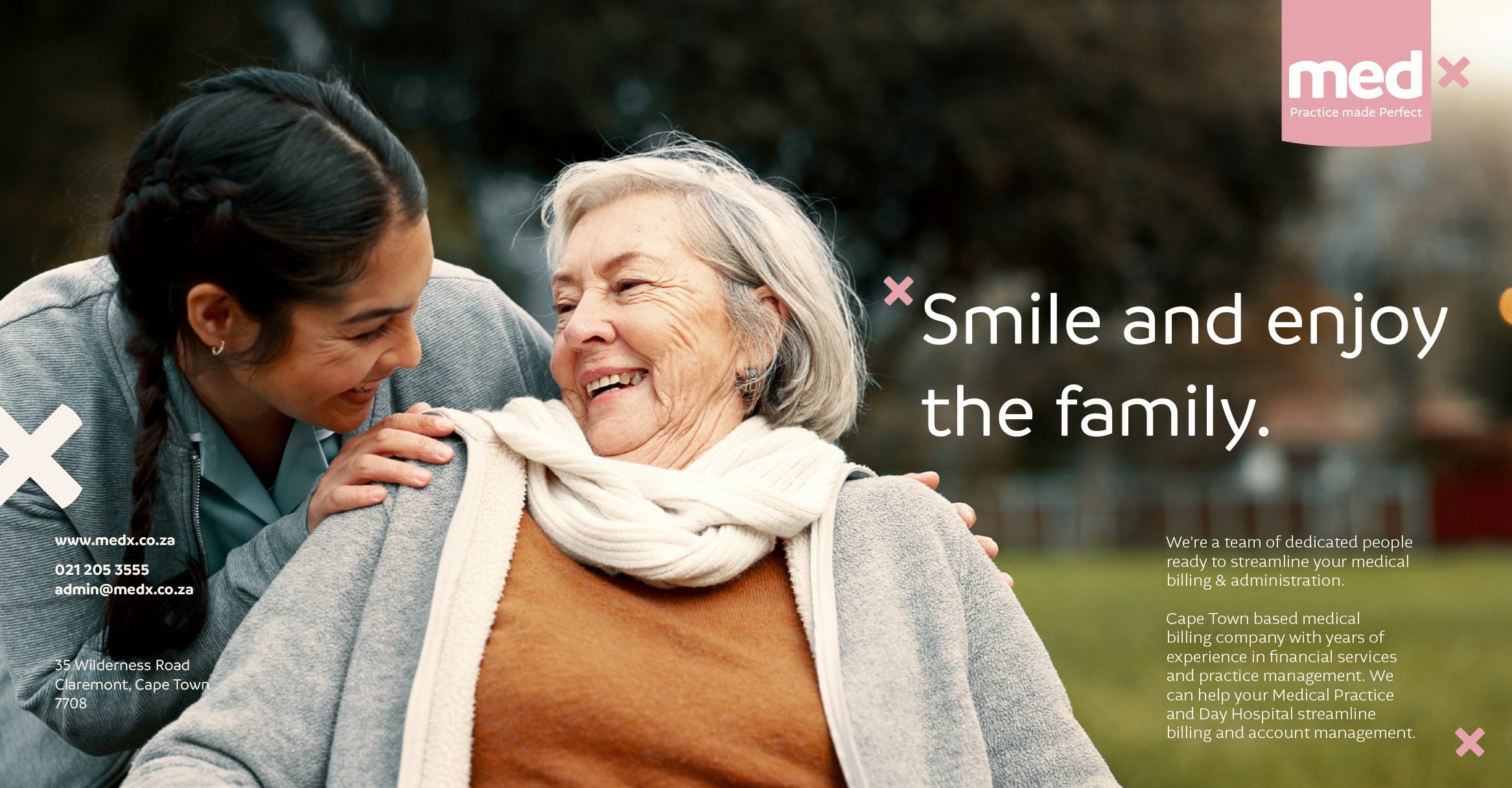
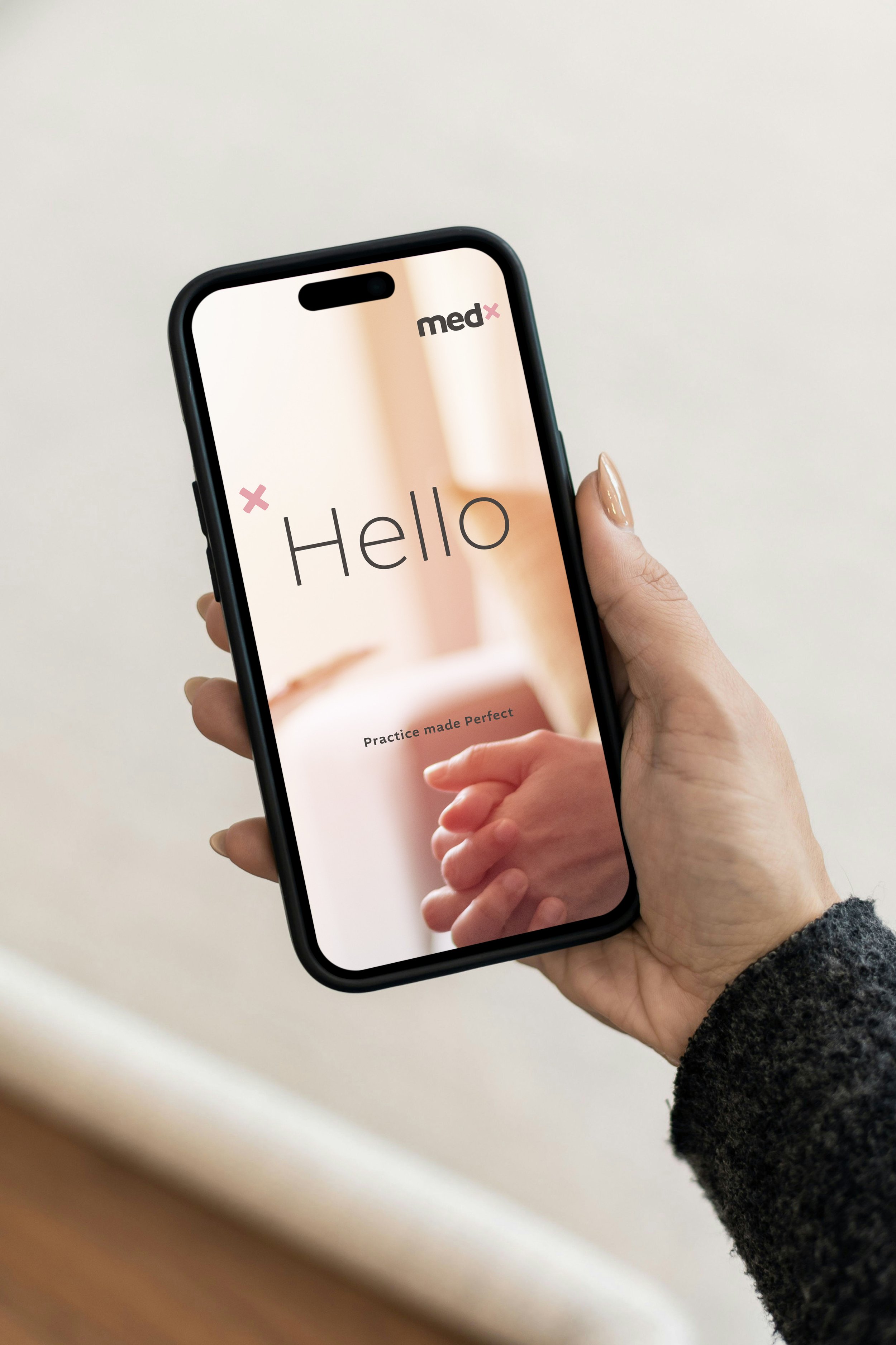
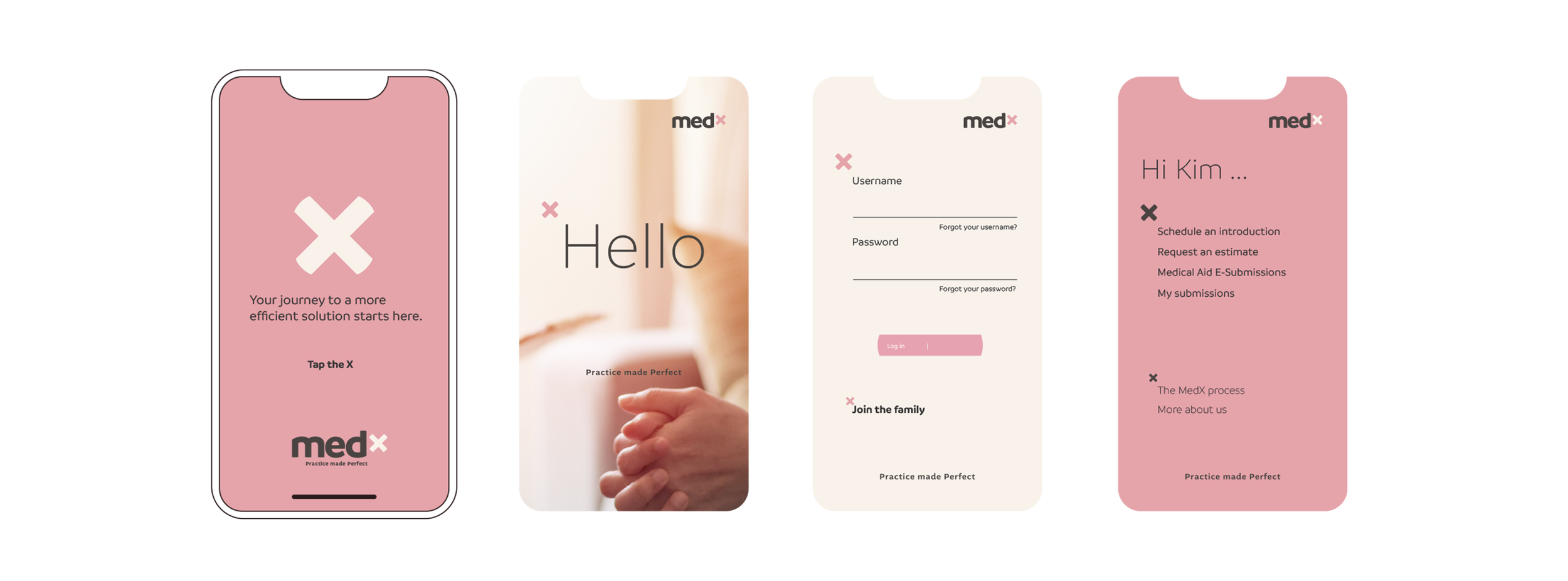
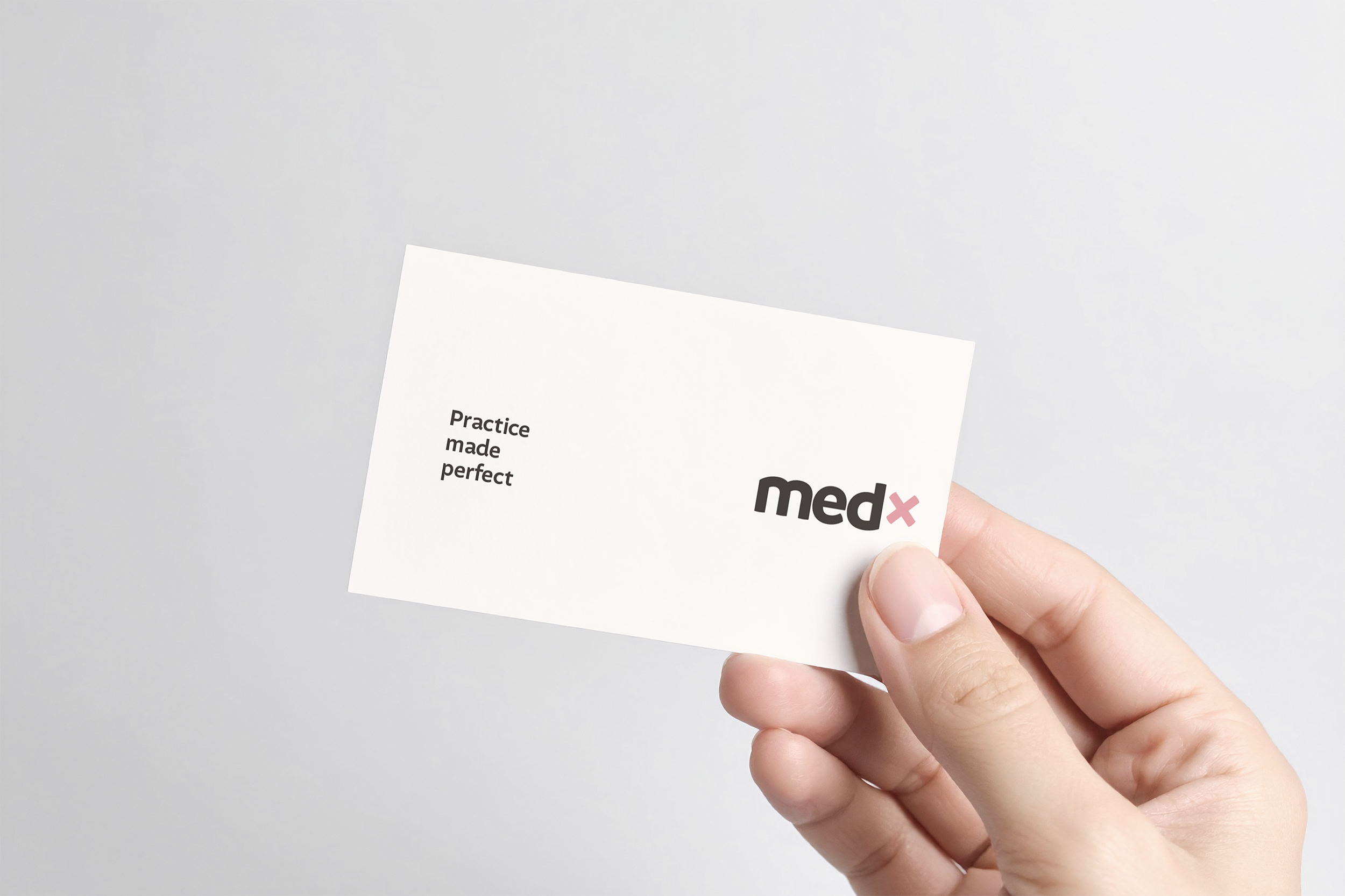
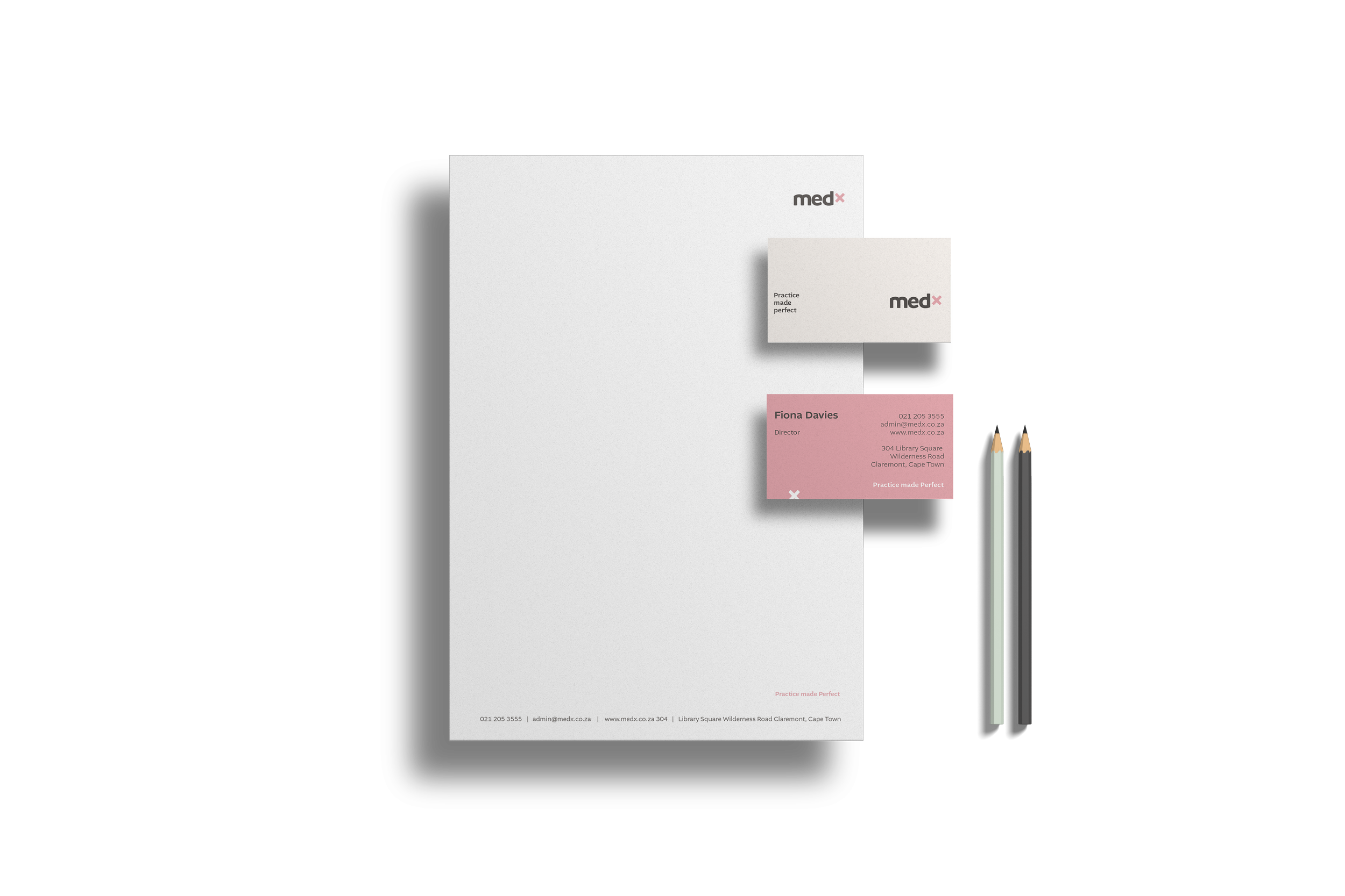
The visual transformation tells the whole story. Evolving from "MedX" to "medx" is not just an aesthetic choice, it's a complete mindset shift from "We are a serious corporation” to "hey, we're here to help." The pink "×" symbol is the brand's signature move, showing up everywhere as a friendly wink that says professional doesn't have to mean boring.
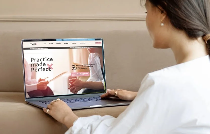
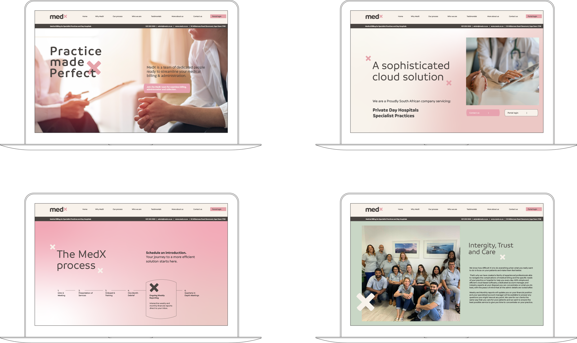
The color palette is where things get really interesting. Instead of defaulting to expected corporate blues and clinical whites, we went bold with blush pink and cream—warm, sophisticated, memorable.
The pink isn't trying to be cute; it's confident enough to show up in boardrooms while still feeling human. Including sage green to build trust and charcoal grey to keep things grounded, the palette that actually makes you feel something positive about billing.
Everything about the design language screams intentionality.
By mixing warm, human-centered design with clean, modern execution, we’ve created something that stands out in a crowded market while building immediate trust.
When your brand identity can make people feel genuinely positive about administrative billing and collections, you know you've created something special.