Foodstop Xpress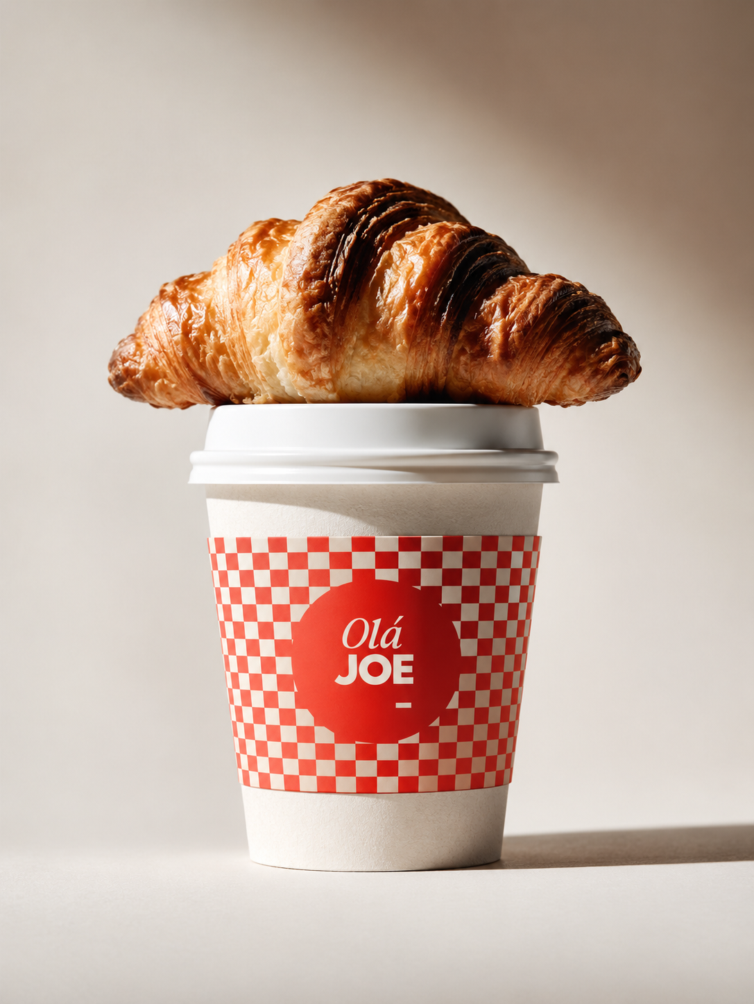
Brand Identity
Visual Language
Livery & Collateral
Foodstop Xpress set out to rethink the traditional convenience store. Part quick-service kitchen, part deli, part everyday pit stop — serving people who want good food, fast, without settling for the usual grab-and-go.
The challenge was to create a brand that balances speed with substance, convenience with quality and a little personality with plenty of purpose. Somewhere between fast food and a proper food experience, FSX needed to make every stop worth it.
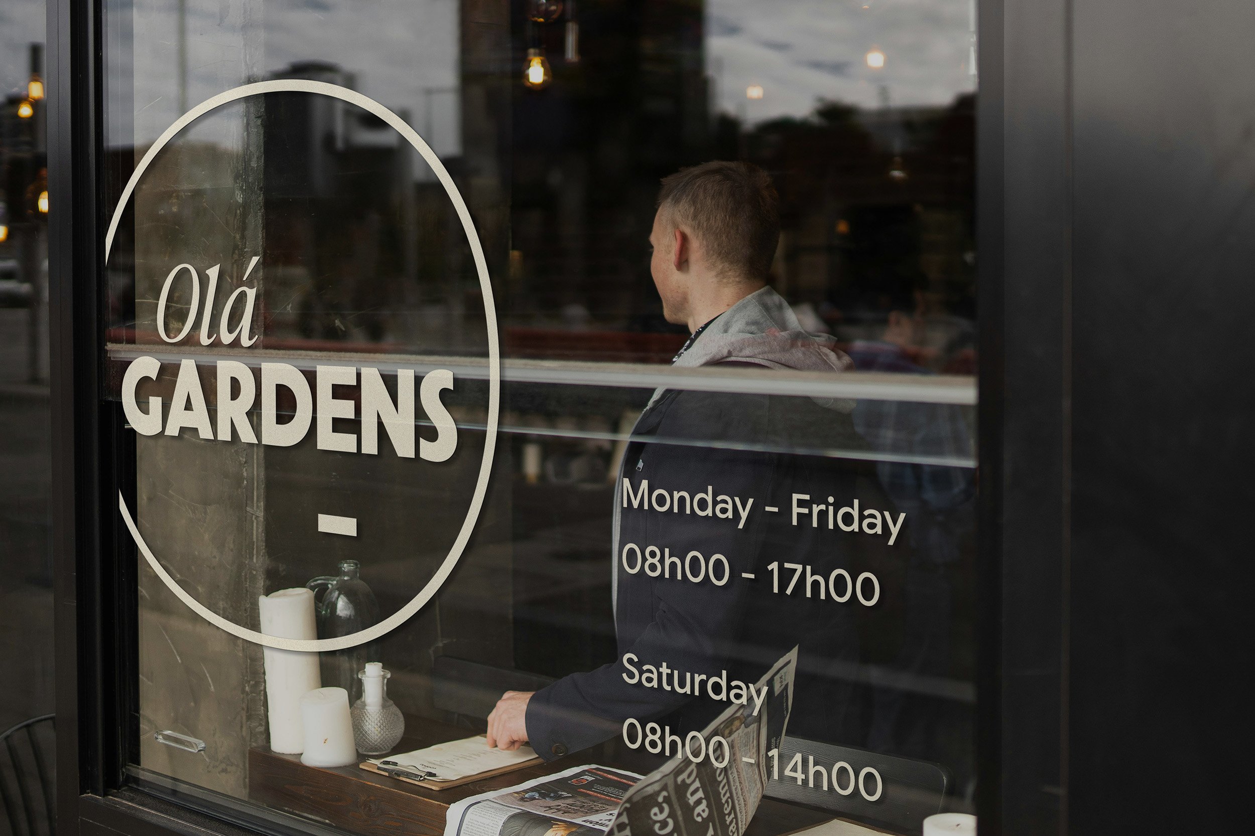
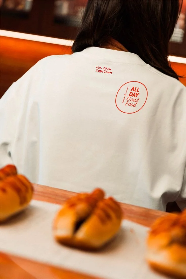
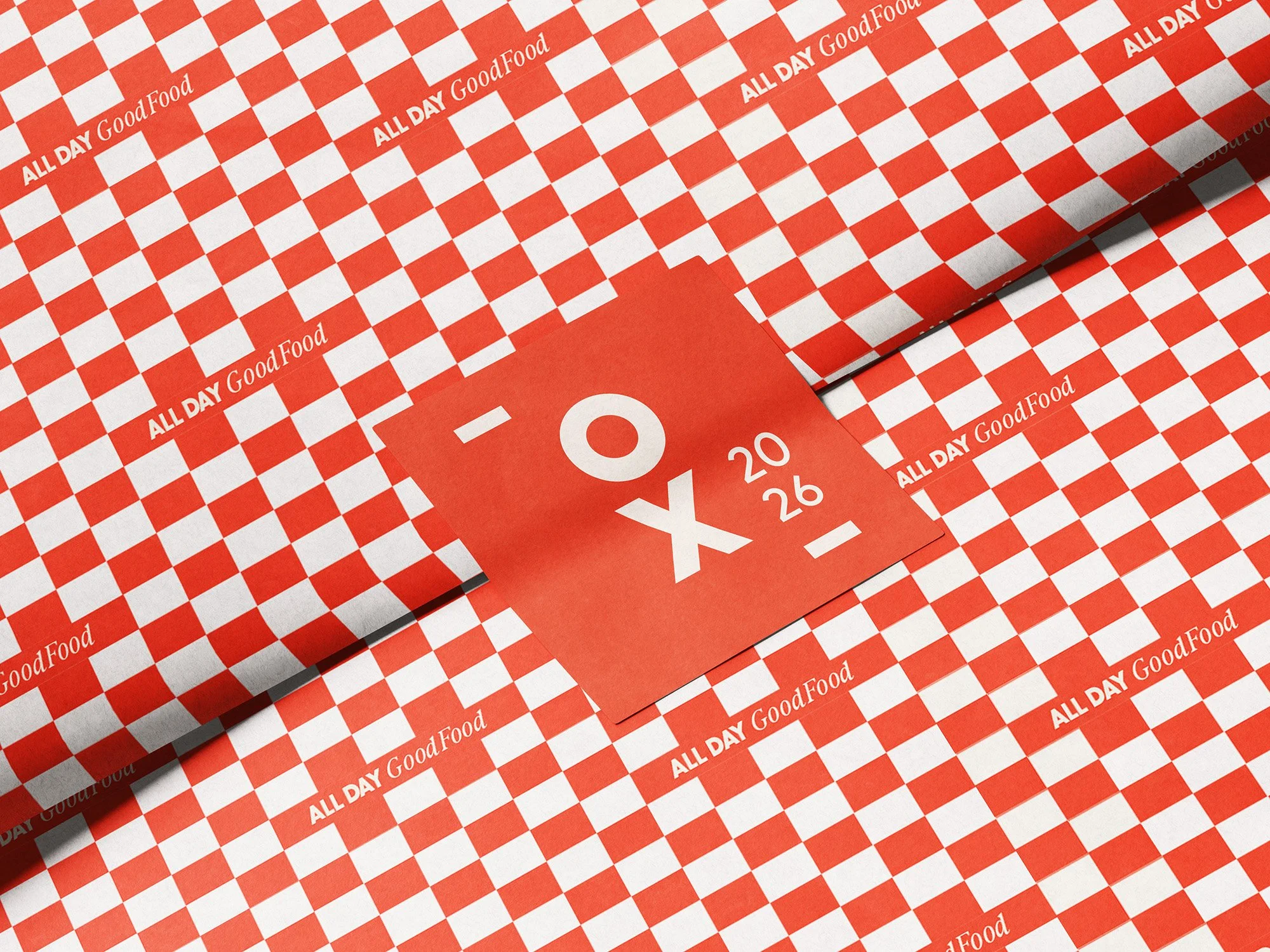
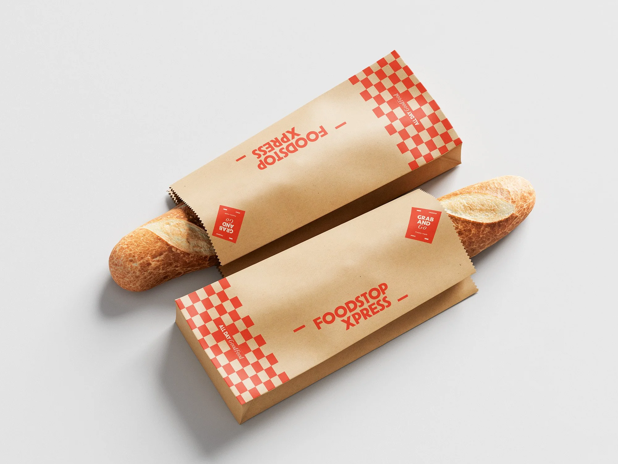
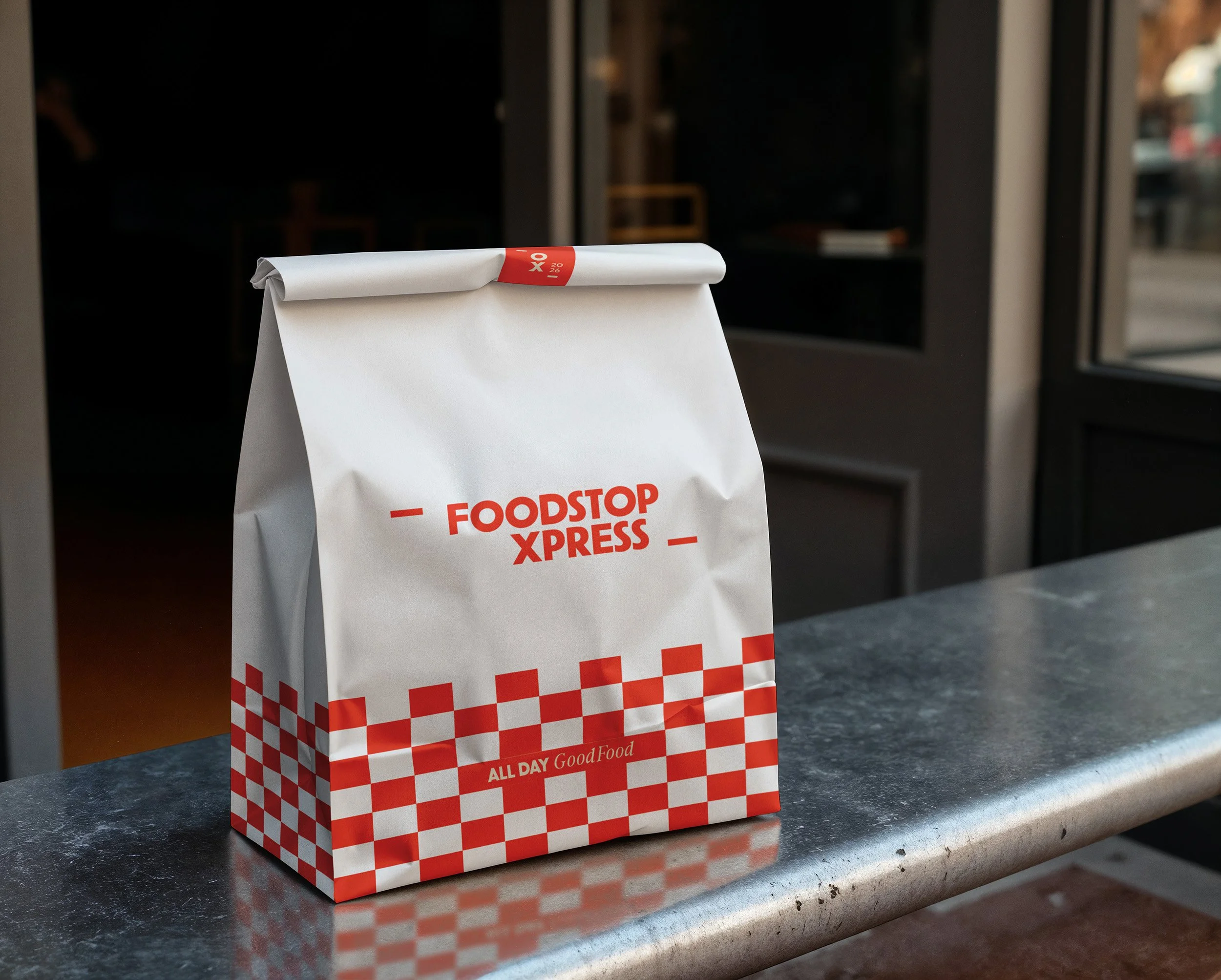
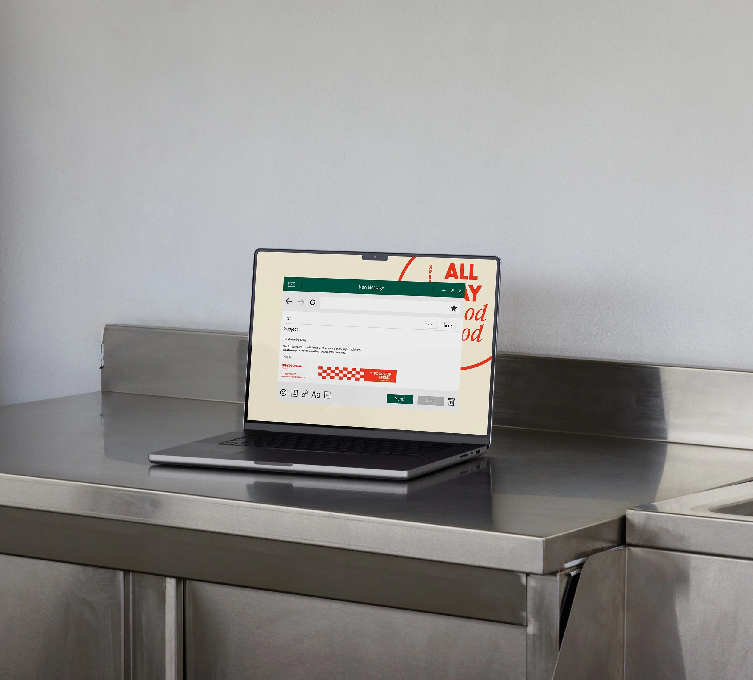
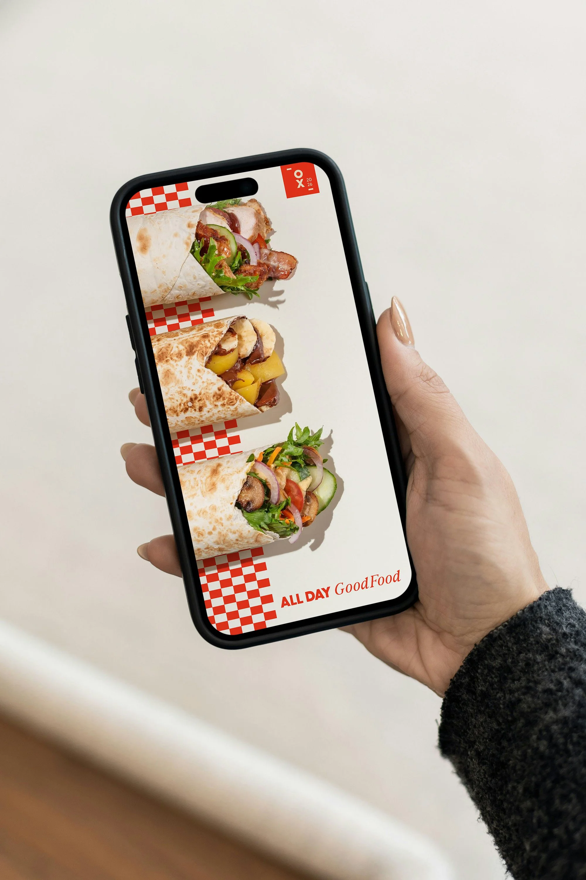
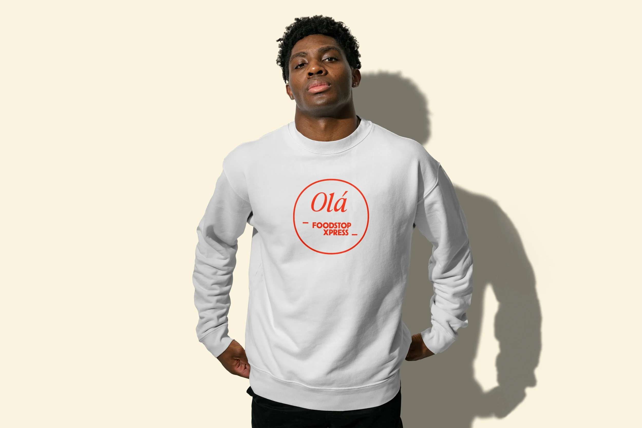
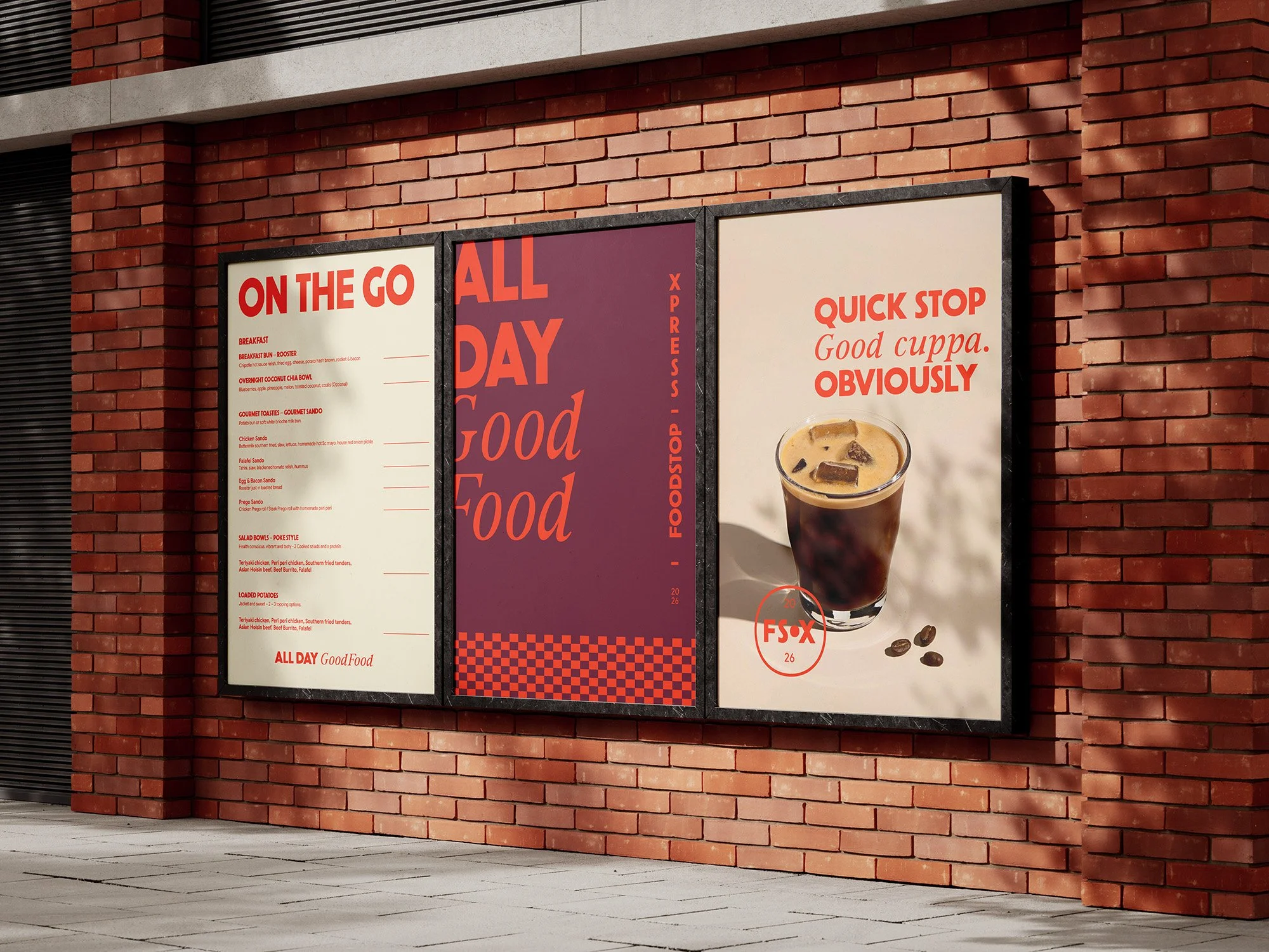
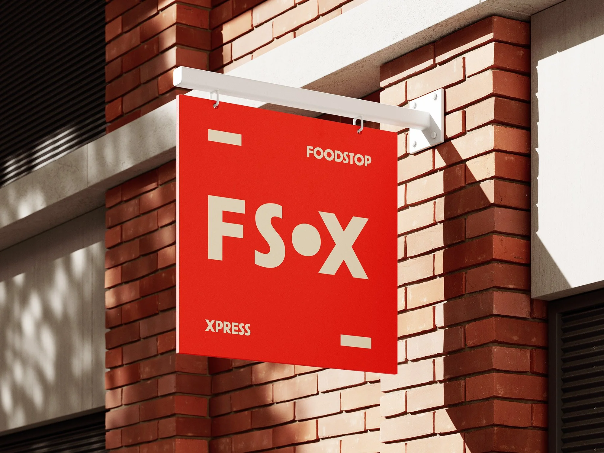
A punchy red palette, bold typography and playful checkerboard graphics give Foodstop Xpress an identity that’s energetic, distinctive and hard to miss. Stamps, stickers and graphic strips add character across packaging, signage and everyday touchpoints, while a more refined labelling system lets the deli range do the talking.
Photography brings the food to life through honest ingredients, satisfying close-ups and real moments of enjoyment. The result is a visual identity that feels fresh, confident and crafted — without getting precious about it.
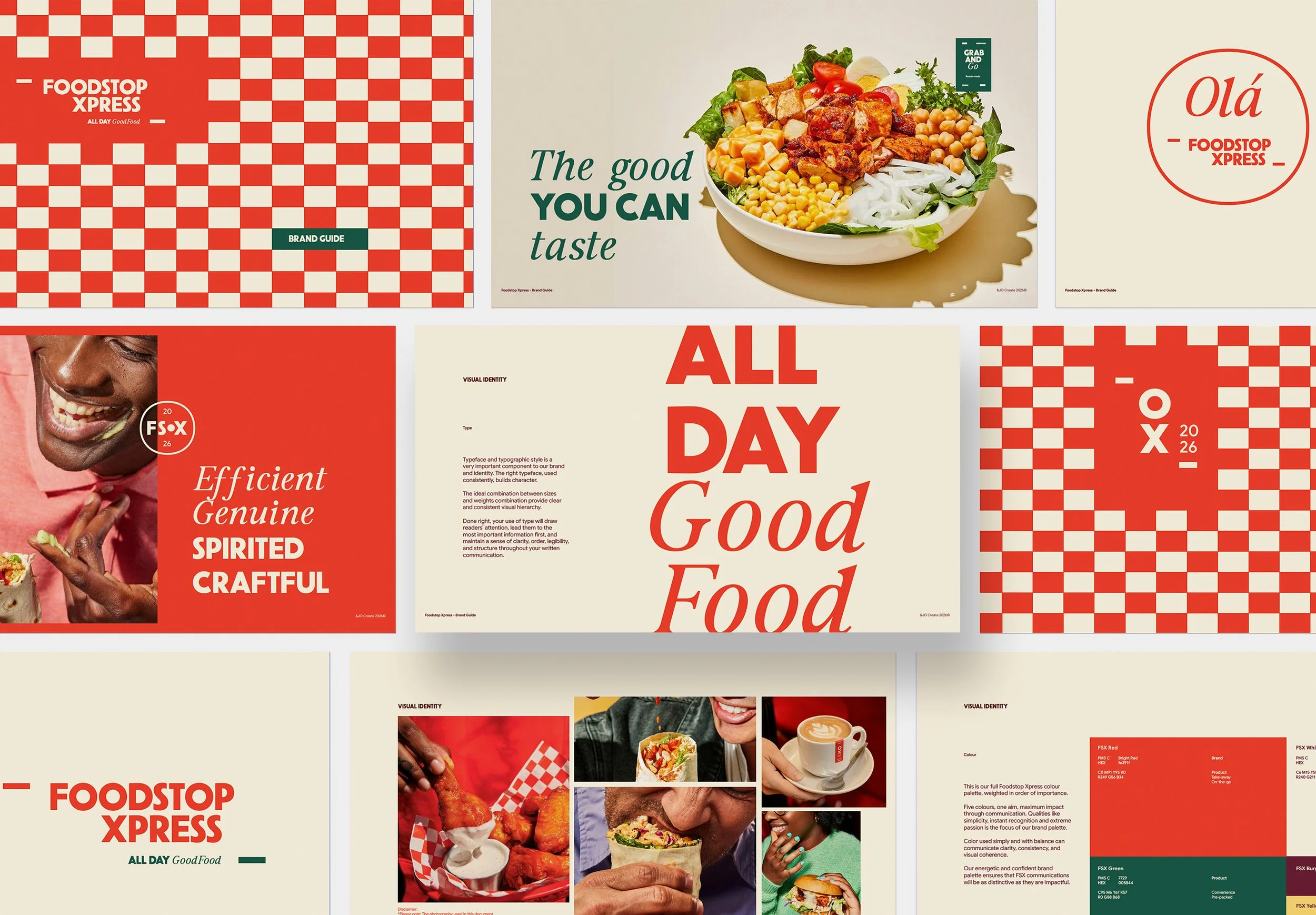
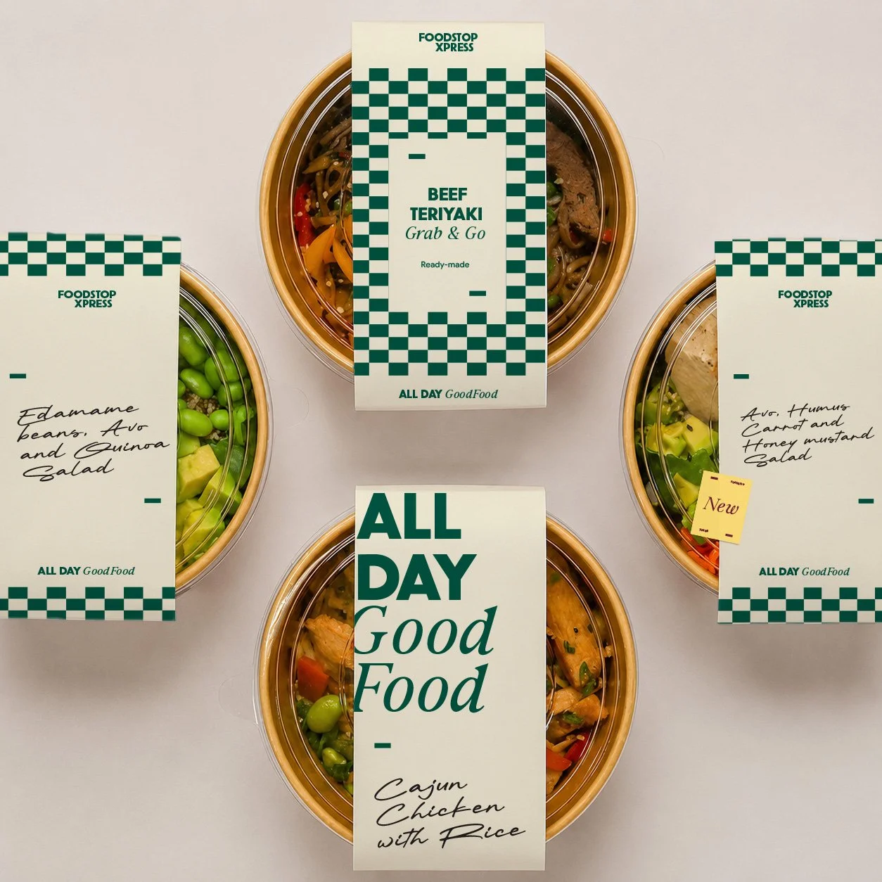
A brand that makes convenience feel a little less ordinary. From the morning coffee run to a quick lunch or something good to take home, every touchpoint balances efficiency with warmth and quality with character.
Because fast food doesn't have to feel like fast food. It just has to be good.
Foodstop Xpress. The good you can taste.