SwissIndependent TrusteesBrand Identity Refresh
Visual Language
Communication Strategy
Livery & Collateral
In collaboration with Etashi Think

In a world where trust is everything, SwissIndependent Trustees needed an identity that felt as independent as its name. One that communicates strength, sound judgement and Swiss precision without feeling cold, corporate or stuck in tradition.
The challenge was to balance the gravitas of wealth and trust services with a more human, contemporary expression. Less old-world formality. More quiet confidence.
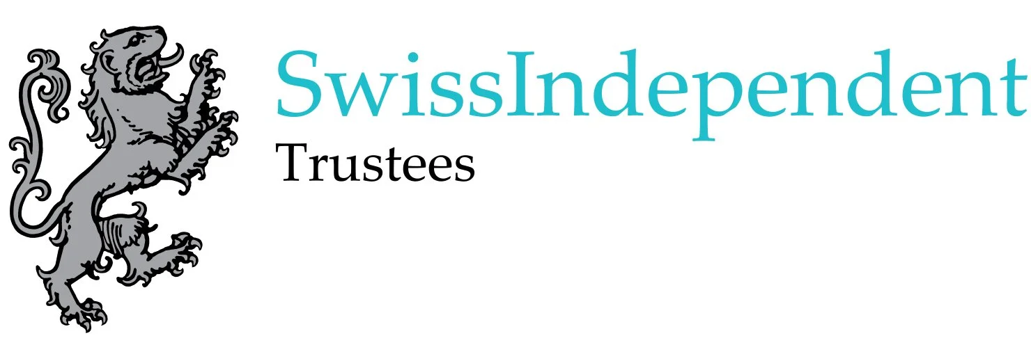
Before
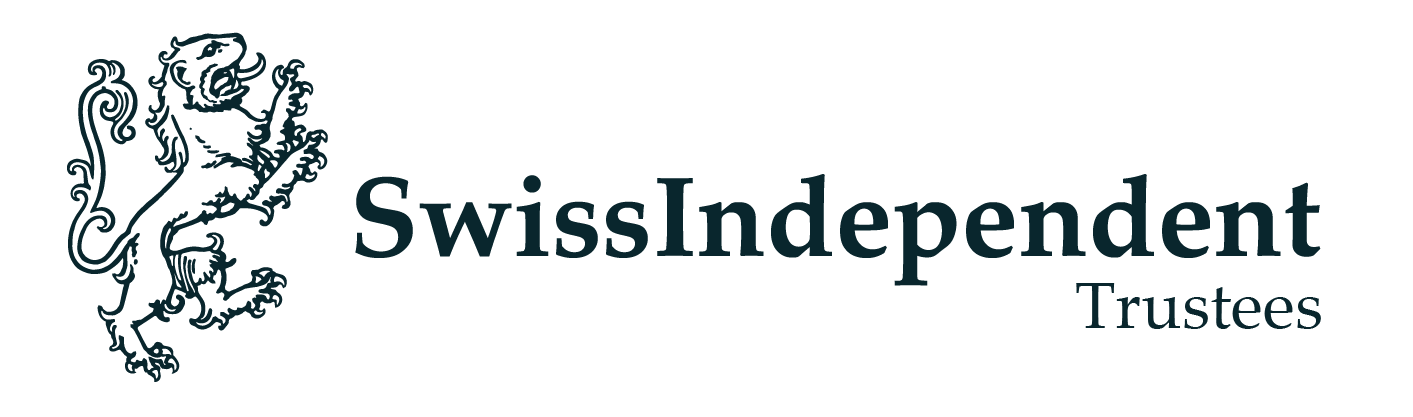
Refreshed
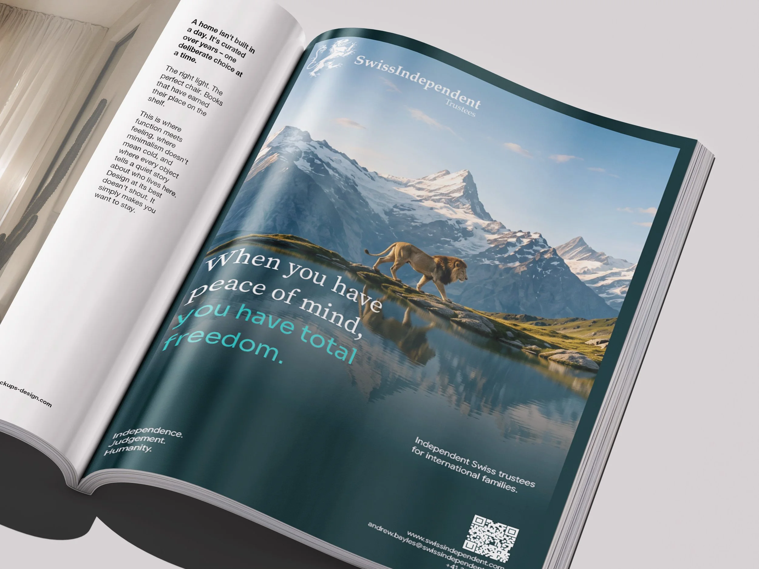
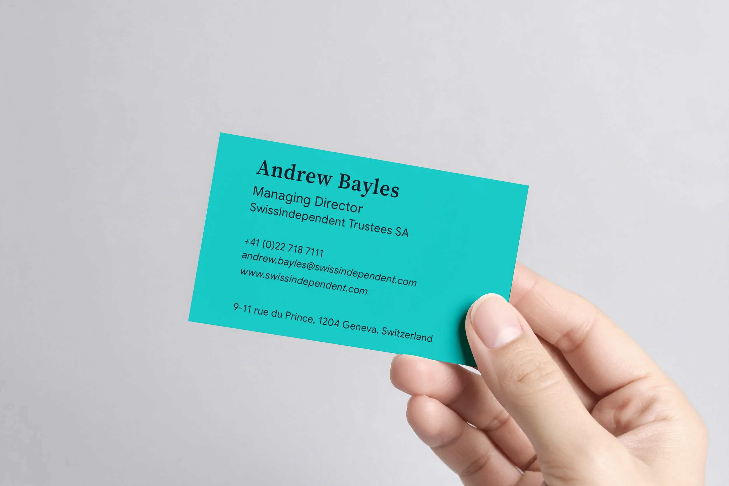
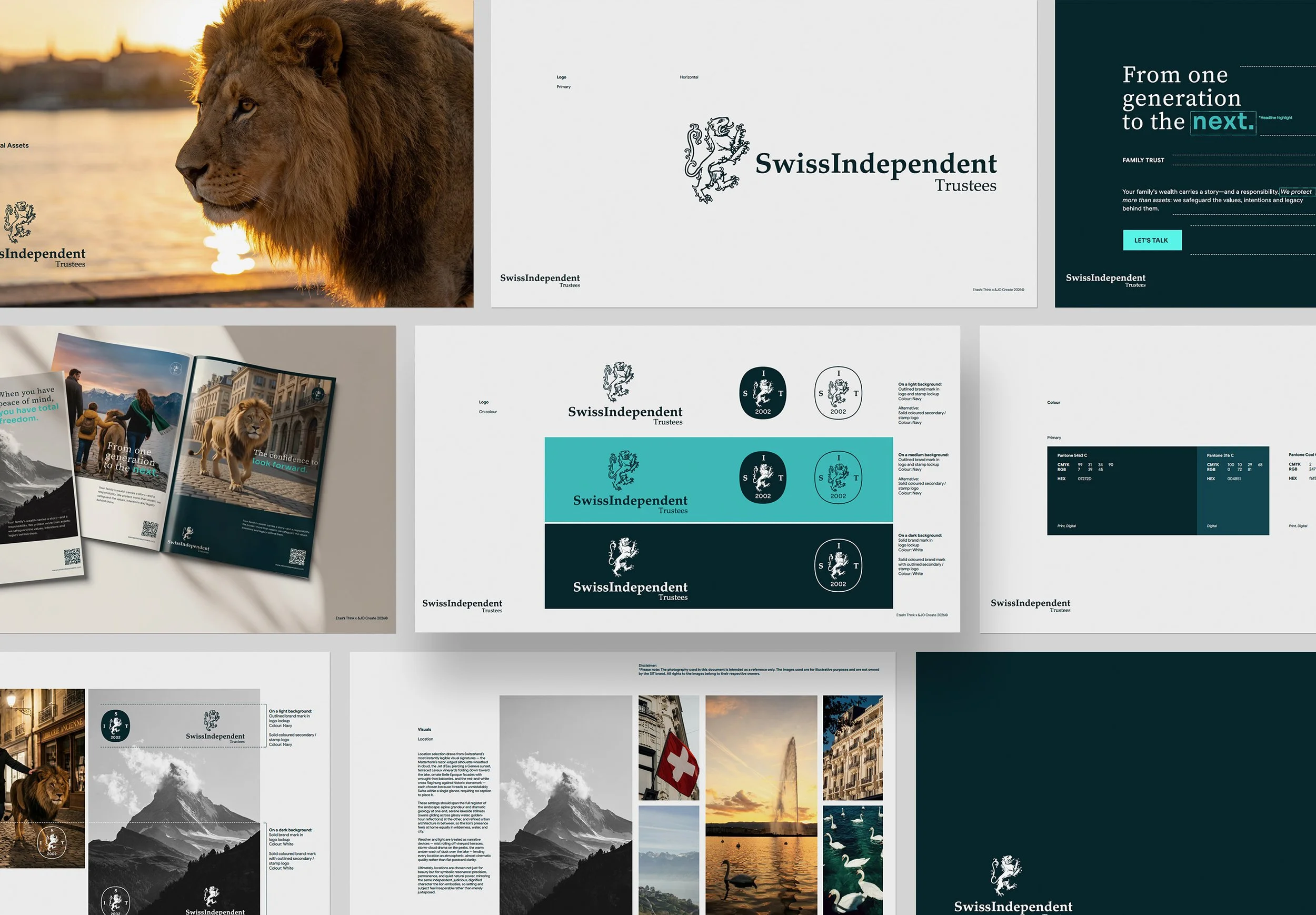
A deep, considered palette of Swiss-inspired navy and teal creates a sense of stability and confidence, while brighter turquoise accents bring a fresh, modern edge. Refined typography balances timeless authority with contemporary clarity.
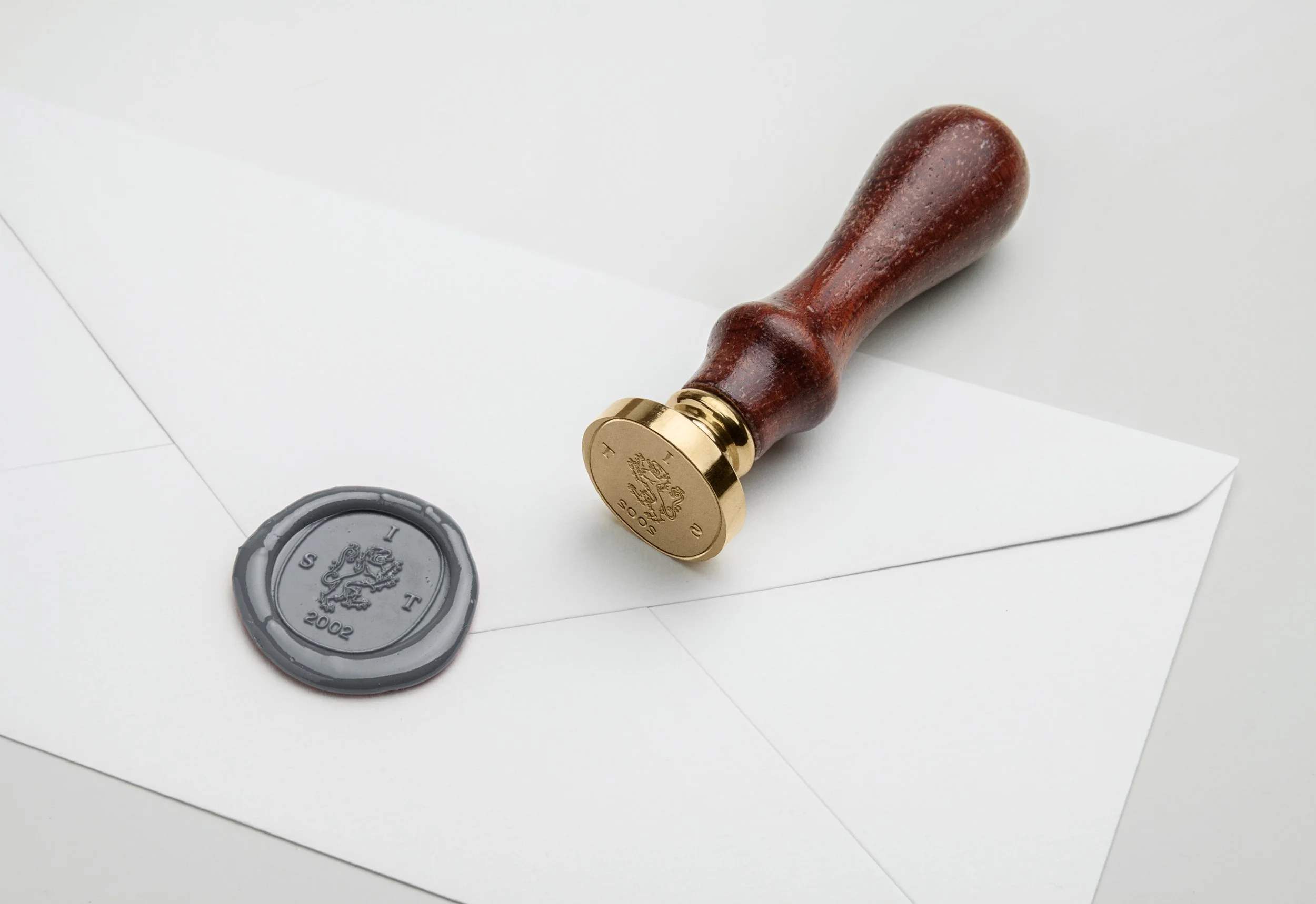
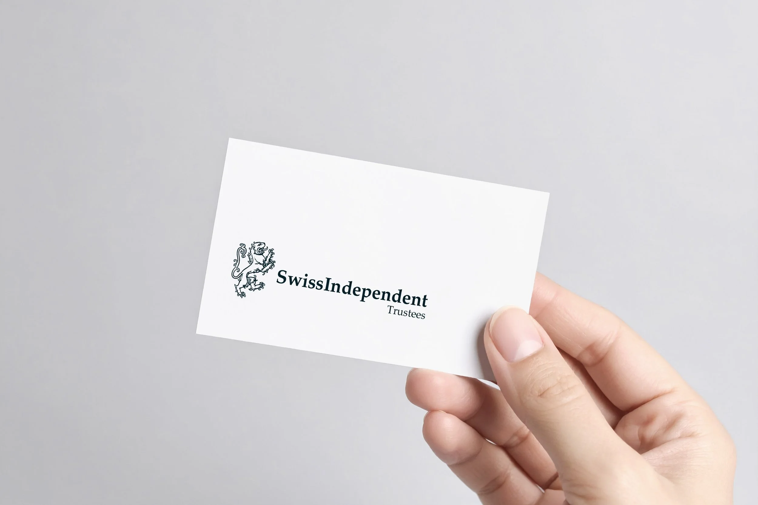
At the heart of the visual identity is the lion — a symbol of strength, independence and sound judgement. But this isn't a lion that needs to roar. Integrated into recognisably Swiss landscapes, it represents quiet authority, protection and trust, with a human warmth that makes the brand feel approachable rather than imposing.
A complementary layer of emotive, monochrome lifestyle photography adds movement, texture and a sense of freedom. Together, the elements create a visual world that feels distinctly Swiss, quietly confident and anything but ordinary.
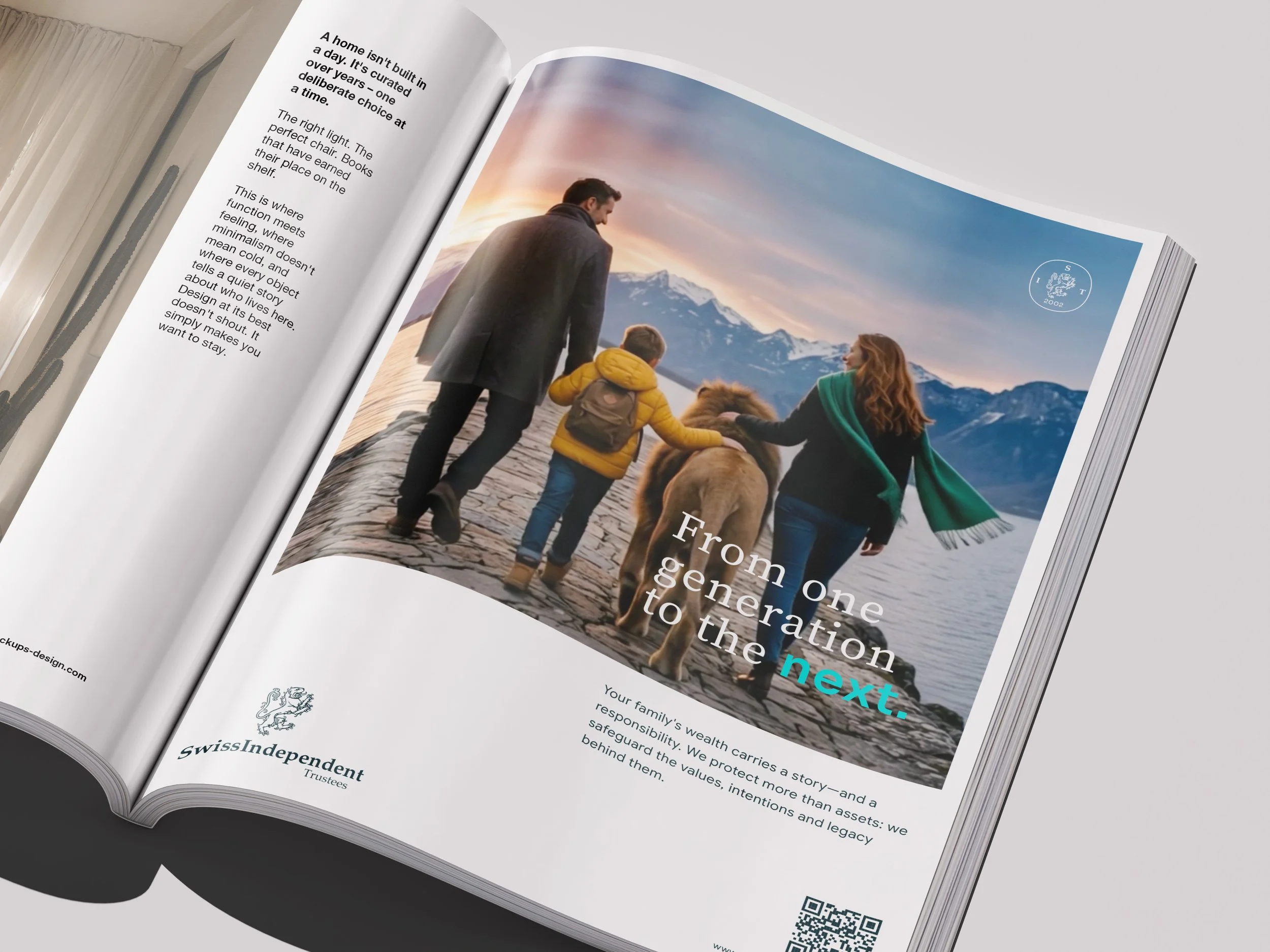
An identity that brings a more human face to an industry built on trust. Sophisticated without being stuffy, confident without being loud and independent by nature.
Because real confidence doesn't need to shout. And trust? That's not something you can put a price tag on.
Independent. Judgement. Humanity.